top of page


COMI
cooking assistan
the challenge
Many beginner home cooks struggle with finding reliable recipes, understanding cooking techniques, and managing time in the kitchen. This often results in wasted ingredients, unhealthy eating habits, and a lack of motivation to cook. The challenge was to address these pain points by building confidence and making cooking more approachable and enjoyable.
the
IDEA
The concept was to develop a solution that empowers novice cooks through customizable, easy-to-follow recipes and practical kitchen tools. By tailoring experiences to the user’s skill level, preferences, and available ingredients, the app aimed to reduce daily cooking stress while encouraging healthier habits and more sustainable routines at home.
the
Process
The design process followed a human-centered approach, starting with user interviews and persona development. Task scenarios, storyboards, and user journey maps were used to uncover key needs and friction points. Visual direction was explored through moodboards, and early concepts were translated into high-fidelity prototypes for iteration and feedback.
Discovery phase
We started with user interviews to explore the needs and struggles of beginner home cooks. Two key user profiles emerged:
-
Students cooking on a budget
-
Users with dietary restrictions
Using empathy maps, user profiles, and journey canvases, we uncovered patterns in behavior and motivation — like the need for quick, affordable meals, limited cooking tools, and a desire for healthier habits. These findings shaped the value proposition and set the direction for the design phase.
User profiles


Value proposition canvas
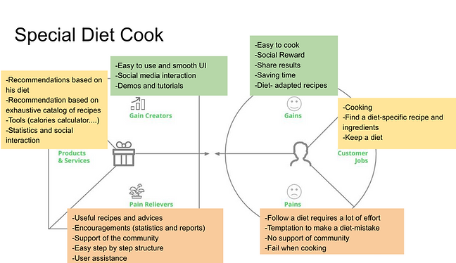
The Canvas model is a strategic tool that provides a clear, one-page overview of a business or project. It summarizes key aspects, aligns the team with a common view, and ensures no important element is forgotten.

Design phase
In the design phase, we translated research insights into concrete design directions. We created moodboards to define the visual identity, journey maps to understand interaction points, and early prototypes to test layout and functionality. These steps ensured the product felt both useful and emotionally engaging for our target users.
Mood board
The moodboard set the visual tone for the project, combining colors, imagery, and textures to guide the overall aesthetic. The goal was to create a joyful and approachable look that made cooking feel less intimidating—especially for beginners.

Journey map
The journey map outlined the key steps users take when planning, preparing, and cooking a meal. It helped identify common pain points, such as missing ingredients or complex instructions, and highlighted opportunities to simplify the experience. This visualization guided design decisions by making user needs and frustrations easy to understand.

Prototype
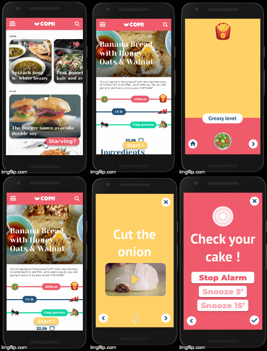
The prototype featured a floating call-to-action (CTA), a hamburger menu for navigation, card-based content, and a step-by-step cooking interface. Users could adjust time and grease levels through simple scrolling interactions. Each feature was designed to simplify decision-making and support confident, stress-free cooking.
bottom of page