top of page


MOBILE EXPERIENCE
the challenge
The mobile experience was already mature and widely used, but we wanted to understand where friction still existed and which areas mattered most to users. The challenge was to identify usability issues without overhauling a product that was already performing well.
the
IDEA
I combined an expert UX review with user research to get a clearer picture of the mobile experience. The goal was to validate which issues were genuinely important, understand user priorities, and identify focused opportunities for improvement.
the
Process
I reviewed key mobile journeys and grouped issues around navigation, layout, interactions, forms, and feedback. I then ran a large-scale survey across multiple markets to understand usage, satisfaction, device switching, and the areas users most wanted to improve.
RESEARCH APPROACH
The research combined an expert UX review with a large-scale user survey. The expert review helped identify usability, consistency, and interaction issues across key mobile journeys, while the survey validated broader user needs, satisfaction, device switching, and improvement priorities.
User profile
Based on interviews with international students in Madrid, the profile highlights common needs like finding housing, using transport, and handling local formalities. Most users were independent, experienced students adjusting to a new city and system.
Personas
Three personas were developed to reflect different types of international students, each with unique motivations, behaviors, and challenges. These helped guide design decisions by keeping diverse user needs at the center of the process.
Card sorting technique
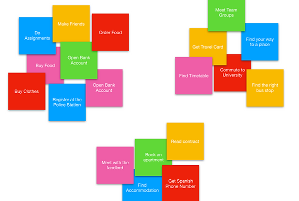
We used card sorting to group tasks mentioned during interviews — such as renting a flat, getting a SIM card, and using public transport. This informed the content structure by aligning with how students naturally categorize their priorities.
Task Organization model
The Task Organization Model outlines the key steps students go through when settling into Madrid. It helped define the app’s navigation and flow by mapping real user routines and decision points.

Design phase
In the design phase, we turned our insights into real interfaces. We used navigation maps to define flows, then designed clean layouts prioritizing clarity. Feedback loops with users helped us refine the prototypes. Every screen was crafted to reduce stress and support independence.
Navigation map
We structured the content based on user tasks to create an intuitive navigation. Each section flows from the homepage to core features like transport, accommodation, and purchases, ensuring easy access and logical grouping of actions.

Layouts
We created layout wireframes that emphasized clarity and user priorities. Key sections and filters are prominently displayed to reduce confusion and help users complete tasks efficiently.

Lo-Fi prototypes
Initial low-fidelity wireframes helped us test basic interactions and structure early on. These sketches ensured that core functionalities aligned with user needs before refining visual design.


Hi-Fi prototypes
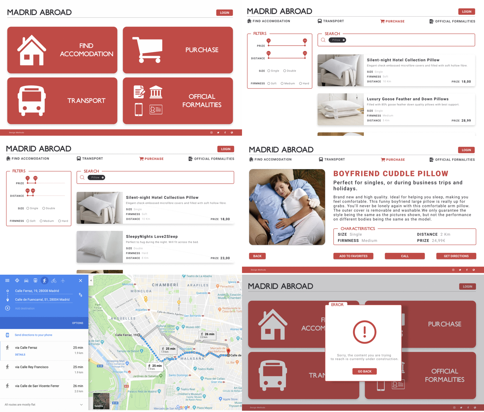
High-fidelity prototypes brought the final design to life, combining real content, color, and typography. These mockups were tested with users for usability, allowing us to fine-tune interface elements and interactions.
Design decisions

We followed Material Design principles and drew visual inspiration from the city of Madrid. A red, black, and white palette reflects local identity. We used Underground NF for a classic feel and Roboto for modern clarity. Layouts were kept clean and intuitive, with flat icons and ample white space to reduce visual noise.
bottom of page